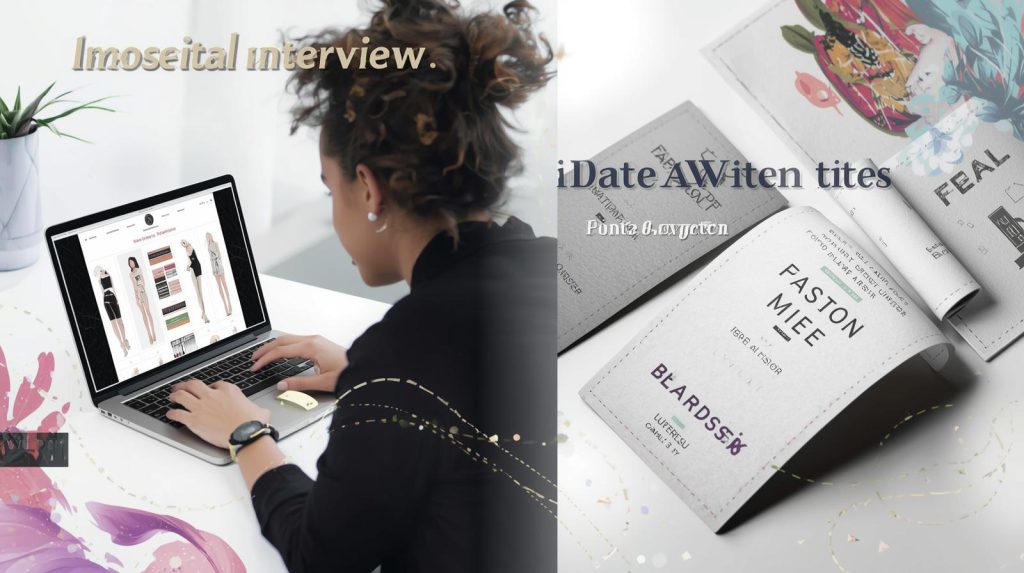
Interview with Our Designer: Expert Tips for Your Label Artwork
An inside look at creating perfect clothing labels with our lead designer, Sarah Chen
Getting your label artwork right is crucial for creating professional, high-quality clothing labels that represent your brand effectively. To help you navigate this process, we sat down with our lead designer, Sarah Chen, who has over 10 years of experience in custom clothing label design.
In this exclusive interview, Sarah shares her expert insights and practical tips to ensure your label artwork is production-ready and perfectly aligned with your brand vision.
Q: What’s the most common mistake brands make when submitting label artwork?
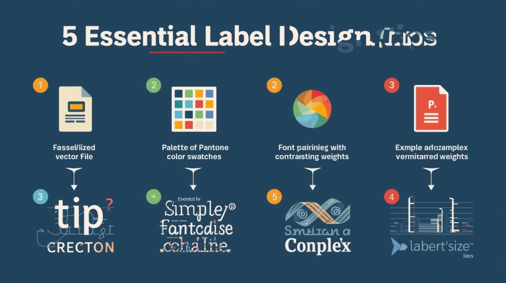
Sarah: “The number one issue is incorrect file formats. Many brands send JPEG or PNG files, which are unsuitable for weaving and printing. These raster images pixelate when enlarged, resulting in blurry labels. Always provide vector files (AI, EPS, or PDF) for crisp, scalable results.”
Pro Tip: “If you don’t have vector files, our design team can recreate your artwork. But starting with the right format saves time and ensures accuracy.”
Need help with artwork? Explore our design services for professional assistance.
Q: What are your key tips for color selection in label design?
Sarah: “Color choices significantly impact both aesthetics and cost. Here’s my advice:

- Use Pantone Matching System (PMS) for color accuracy
- Limit your color palette – fewer colors often look more sophisticated and cost less
- Consider contrast – light text on dark backgrounds (and vice versa) ensures readability
- Understand color limitations in weaving – very fine color gradients don’t translate well”
Pro Tip: “For vibrant satin labels, stick to solid colors with good contrast. Our satin woven labels work best with bold, clear color choices.”
Q: How important is typography in label design?
Sarah: “Typography is everything! The right font choice can make your label look premium or cheap. My guidelines:
- Choose legible fonts – avoid overly decorative styles for small text
- Size matters – ensure text is large enough to read but proportional to the label
- Font weight – thicker fonts weave better than thin, delicate ones
- Limit font varieties – use maximum two complementary fonts”
Pro Tip: “Test your design at actual size to ensure readability. What looks good on screen may be unreadable when woven small.”
Q: What should brands consider regarding label size and layout?
Sarah: “Size constraints are often overlooked. Consider these factors:
- Application method – where will the label be sewn?
- Readability – can customers easily read the information?
- Proportion – does the size fit the garment appropriately?
- Content hierarchy – what information is most important?”
Pro Tip: “For care instruction labels, ensure there’s enough space for all required information without crowding. Our printed care labels can accommodate more detail than woven ones.”
Q: Any special considerations for logo design on labels?
Sarah: “Logo adaptation is crucial. A logo that works on a website might not work on a small label. Key considerations:
- Simplify complex logos for small-scale reproduction
- Maintain key brand elements while ensuring clarity
- Avoid tiny details that may disappear in weaving
- Consider logo orientation – horizontal vs. vertical layouts”
Pro Tip: “We often create simplified versions of client logos specifically for label use. This maintains brand recognition while ensuring technical feasibility.”
Q: What are the current trends in label design?
Sarah: “We’re seeing several interesting trends:
- Minimalism – clean, simple designs with plenty of white space
- Sustainability messaging – eco-friendly certifications and symbols
- Vintage revival – classic typography and retro color palettes
- Custom shapes – moving beyond traditional rectangles”
Pro Tip: “While trends are interesting, focus on creating a timeless label design that will represent your brand well for years to come.”
Q: How can brands ensure their artwork is production-ready?
Sarah: “Follow this checklist before submitting artwork:
- Vector files in AI, EPS, or PDF format
- Pantone colors specified for each element
- Clear hierarchy of information
- Actual size mockup reviewed
- Bleed and safe zones accounted for
- Fonts converted to outlines or included
Pro Tip: “When in doubt, ask for a digital proof. We provide detailed proofs showing exactly how your label will appear before production begins.”
Ready to create? Start with our custom label options and upload your artwork for review.
Q: What’s your best advice for brands new to label design?
Sarah: “Keep it simple, especially for your first order. Start with a clean, classic design that focuses on readability and brand recognition. Remember that your label should complement your garment, not overwhelm it.
Most importantly, partner with an experienced manufacturer who can guide you through the technical requirements. Good communication between design and production is key to achieving the perfect label.”
Final Thoughts from Our Designer
Creating the perfect clothing label requires balancing creative vision with technical practicality. By following these professional tips and working closely with your manufacturer, you can develop labels that enhance your brand identity and withstand the test of time.
Need professional help with your label artwork?
Contact our design team today for a free consultation: Get Started
Explore our full range of label solutions: View Products
Related guide: Woven Labels for Clothing Manufacturers